Originally published on Fingertips on 08/02/10
Amid the advances represented by Apple’s iPad and Amazon’s Kindle I’ve felt like something of a Luddite lately as I’ve made my way through assorted battered paperbacks.
Amid the advances represented by Apple’s iPad and Amazon’s Kindle I’ve felt like something of a Luddite lately as I’ve made my way through assorted battered paperbacks.
Unlike the Luddites I’ve so far not managed to get my hands on an iPad or Kindle, but then I don’t really feel any inclination to do so either.
This is partly because I’ve got so many unread books lying around – the product of having eyes bigger than my bookshelves and spending too much time browsing in charity shops – but also because I love books not just as literature, but as objects in themselves.
I don’t know what an iPad feels like, but it can’t feel much different to an enlarged iPod which feels cold and soulless. I’d always rather put on a CD album and flick through its sleeve notes than listen to it on my iPod and read about the album online.
But even more than CDs, books have a unique, tangible side to them. Every book is different, be it in size, thickness, hardness, smell, or feel.
As I wrote about the new design of the Granta magazine – a deceptive name as it’s actually produced in book format – on one of my now-abandoned blogs back in 2008:
“When I picked it up, I felt drawn to it. Its matt cover is seductively calm to hold and as your hands brush the gloss cover image something akin to arousal flutters through your fingers.
“This new Granta is engaging more of my senses than the old Granta. It has a new smell, and these thicker pages sound different as I turn them. Maybe I should lick it.”
Just as important as the feel and the smell of a book is its cover.
Covers can define a book, can set the idea of a book firmly in our heads before we’ve read it and be the first trigger points when we remember a certain book.
Penguin’s cover designs
Penguin’s changing approach to cover design is documented in Phil Baines’s book Penguin By Design.
With the arrival of the 60s and Alan Aldridge as art director, the company’s covers became less generic and more about expressing an individual book’s ideas.
This was seen in the cover for Aldous Huxley’s Island and has continued to the present day thanks to designers like David Pelham who developed the idea of giving authors’ books a particular look.
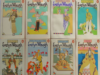
Take for example the Evelyn Waugh covers that he oversaw, which for some readers may define the books as much as the books themselves.
Wayne Gooderham discussed this last year on the Guardian Books Blog:
“Obviously, the text is the thing, but the cover of a book can surely influence our reading of said text. I’m sure there are many readers of Breakfast at Tiffany’s who cannot help but picture Holly Golightly looking uncannily similar to Audrey Hepburn thanks to the cover photograph’s tyrannical hold over our imagination.”
The perfect cover
He goes on to discuss the search for the perfect cover, and that for him the first Faber and Faber paperback edition provided just that for Paul Auster’s New York Trilogy.
Yet my copy of New York Trilogy is a later edtion, and this for me is the perfect cover: with its simple blurred shot of a quintessential American image it represents pure Auster – something American, undoubtedly, but seen through the squinted and suspicious eyes of years spent feasting on European literature.
Gooderham’s preferred cover just looks tacky, like GCSE art work. It doesn’t feel beautiful and real yet slightly unsettling in the way that Auster’s writing does.
The point is that books are objects of beauty that hold an individual allure. Your copy of such and such a book is your copy, and every crease in the spine that you’ve fingered for hours while reading it is yours alone. Every faded page or every coffee stain is yours.
Like an animal marking out his territory, you have marked this out as your book, and the cover is a part of that. And the dirty stain that my copy of John Banville’s The Infinities acquired after I put my bag in a puddle is for me an ineluctable and significant part of the cover design.
And this individuality is something that a Kindle or and iPad cannot provide.
My Kindle and your Kindle are the same. They look the same, feel the same, smell the same.
With the arrival of electronic readers the pleasures that one can take in developing a bookcase, rearing it and watching it grow as a part of your home – and as a part of you – are slowly being forced out the door.
My book collection is precious to me, and God only knows what would have happened if it had all been stored on a Kindle or iPad that I’d let into contact with a puddle.


No comments:
Post a Comment